Navigation Redesign
Case study The Metropolitan Museum of Art
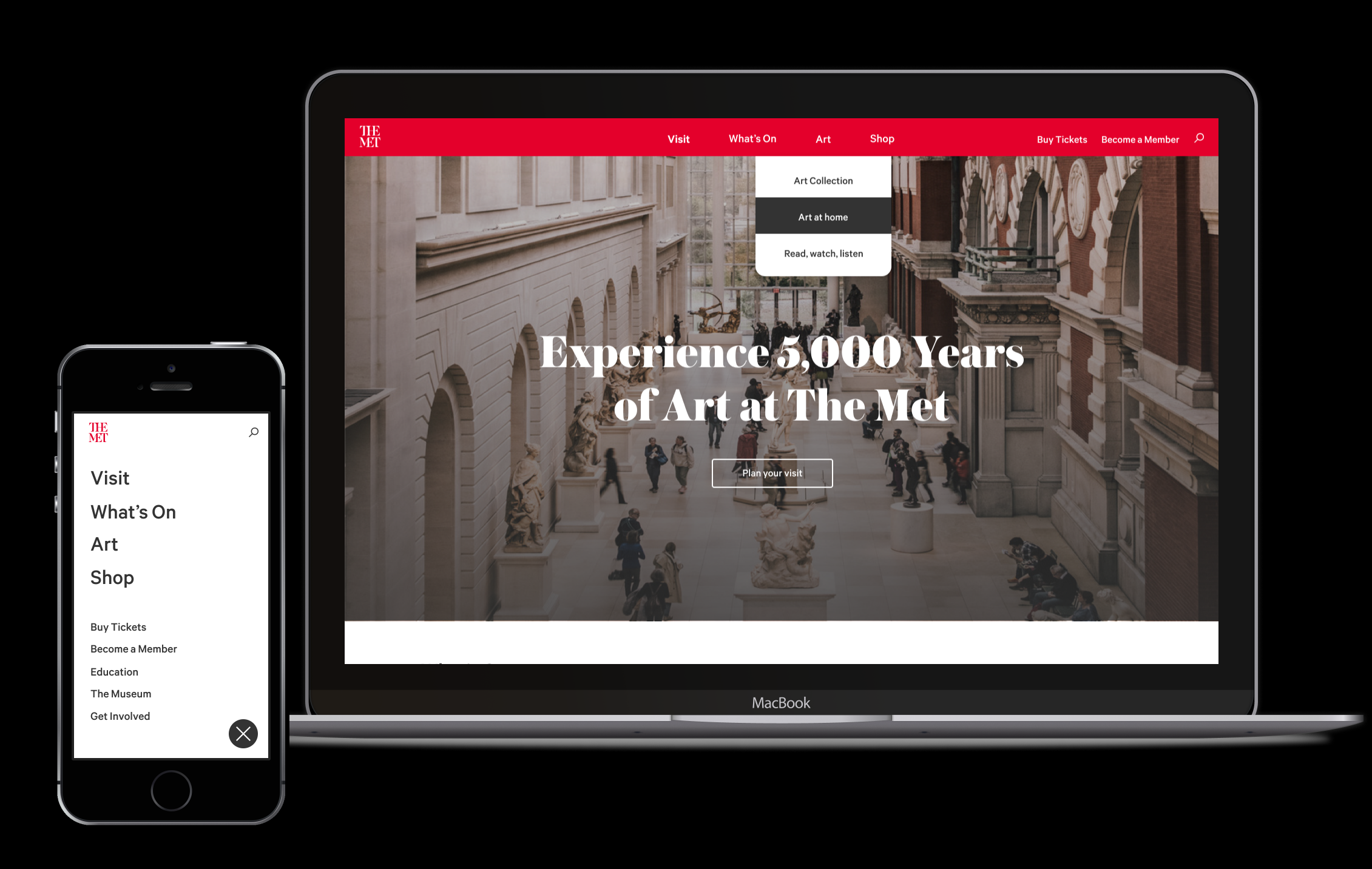
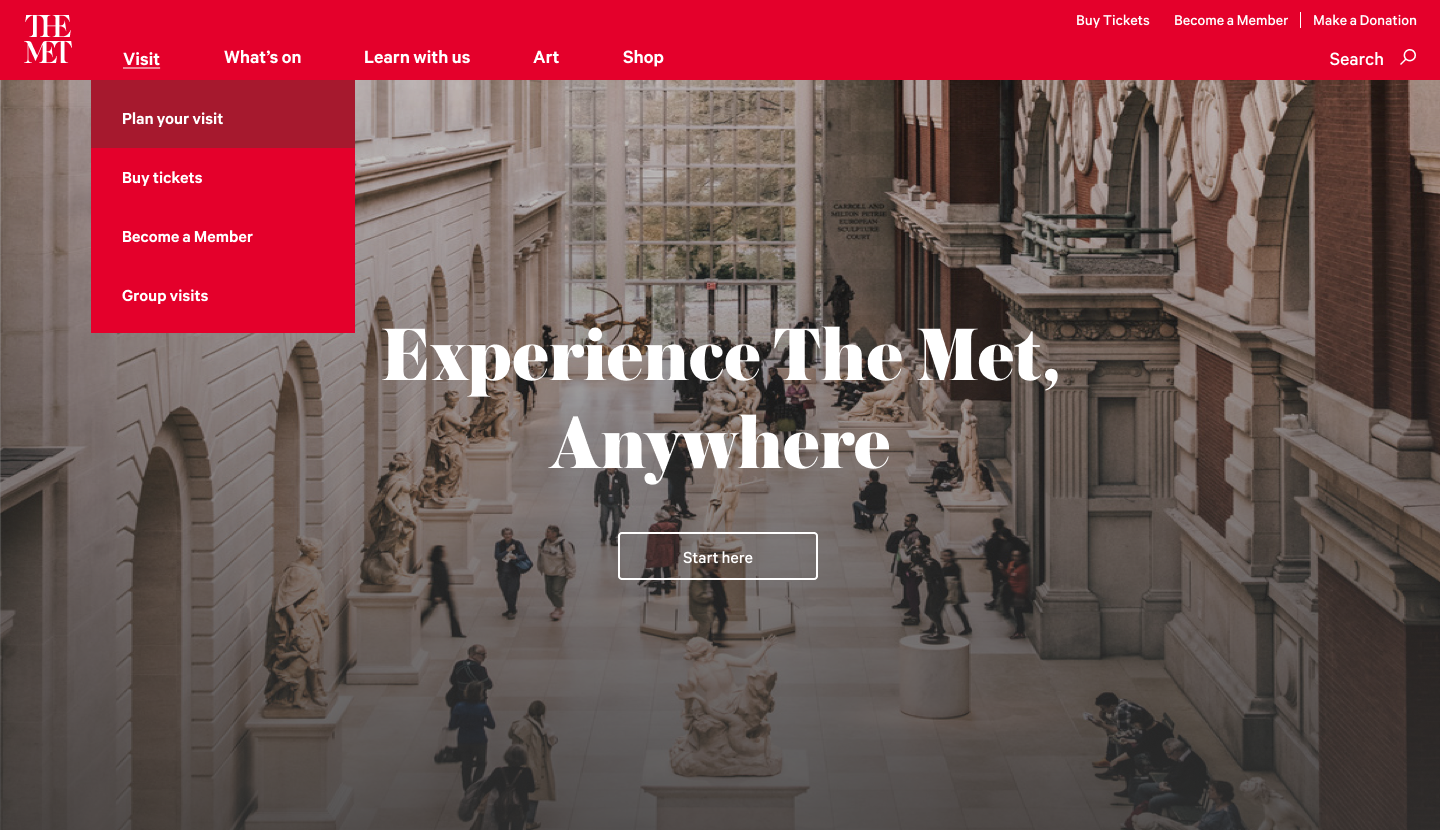
The third most visited museum in the world; over 32M people a year visit The Met Museum’s website. The first thing they see is the header.
The
header performs a lot of roles. It introduces the brand and establishes trust,
provides navigational context and generates revenue.
We learned ours needed some love.
Product Designer
2020
The Goal
To enable and empower users to confidently navigate our site and accomplish their goals in an efficient and intuitive navigation experience.
The Vision
To create a top navigation that is mobile friendly, visually compelling, and is user centric and accessible in its origination and language.
Problem #1
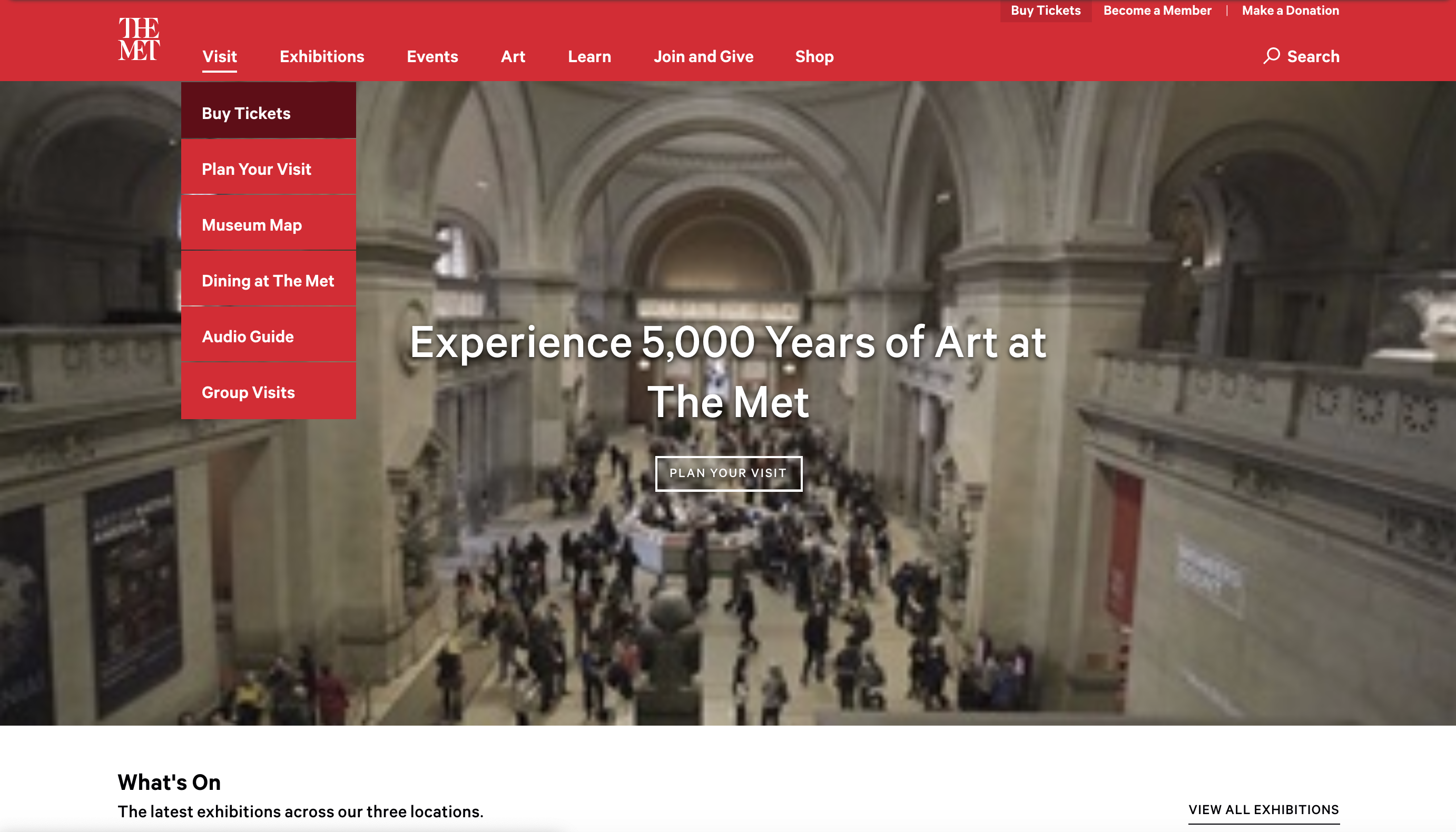
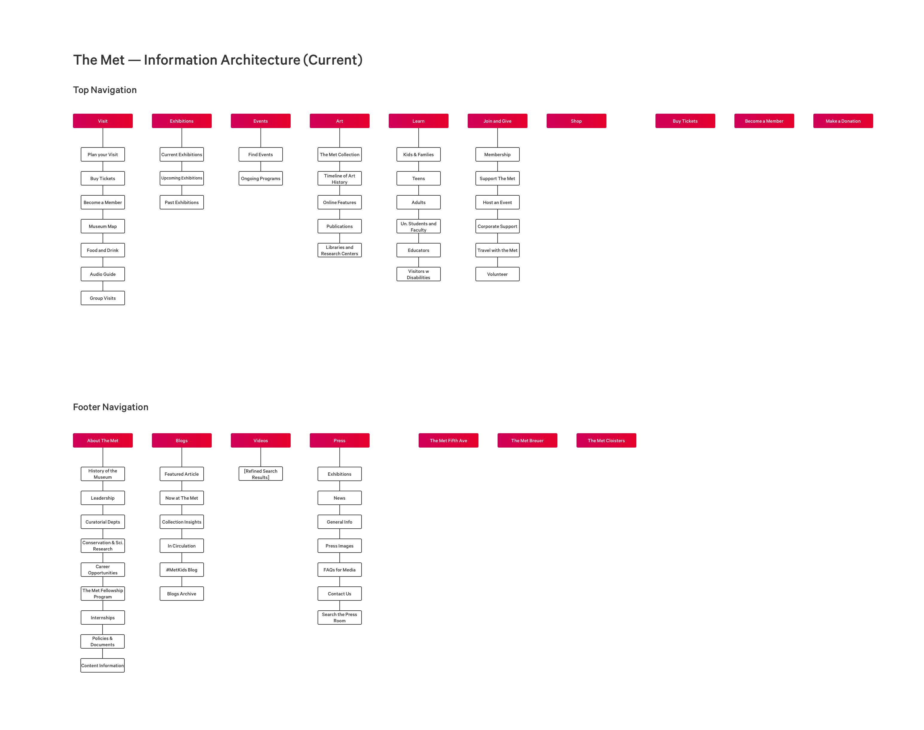
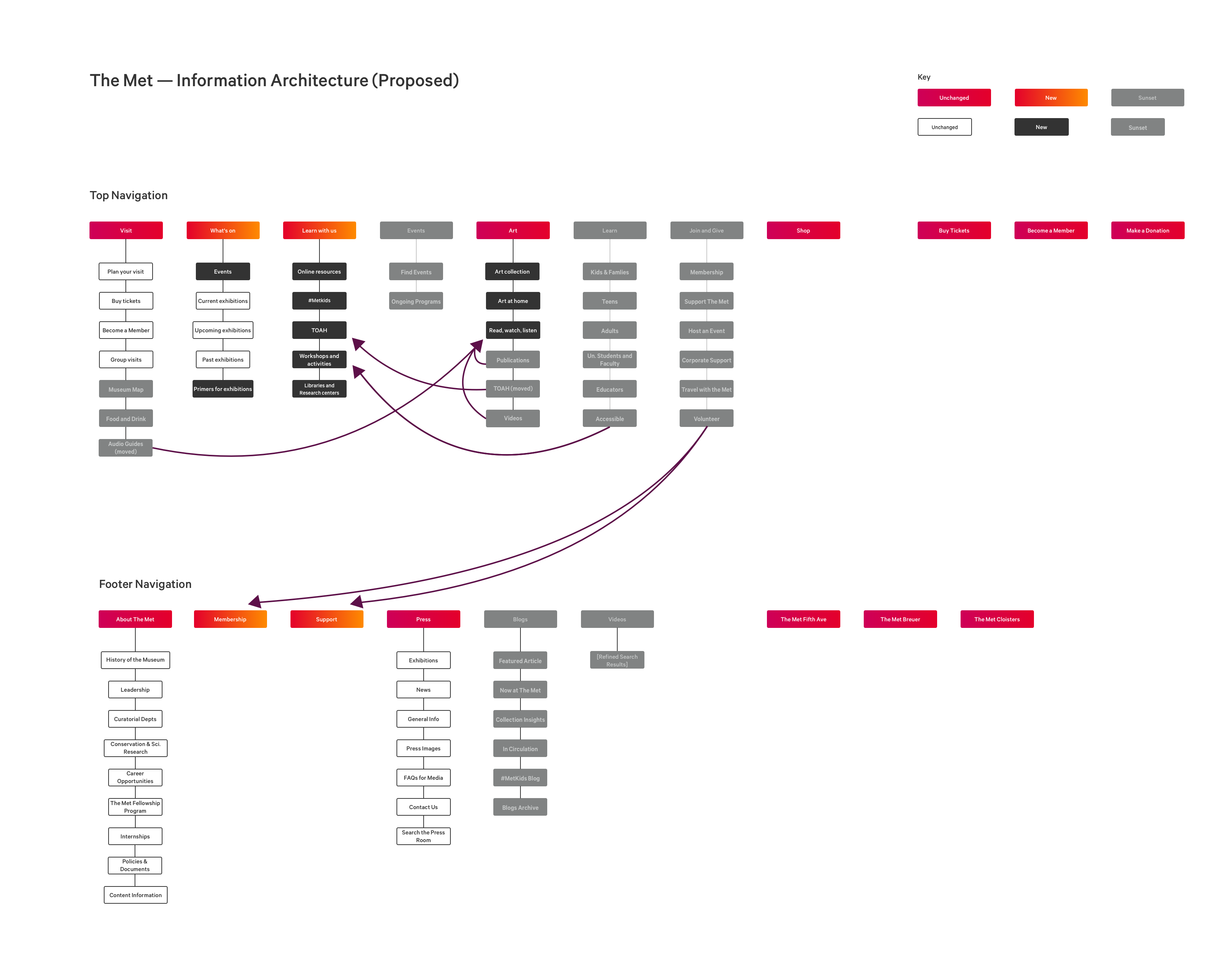
Our navigation was structured in a way that reflected how the Museum departments are organized as opposed to what users are looking for.
 .
. 
Problem #2
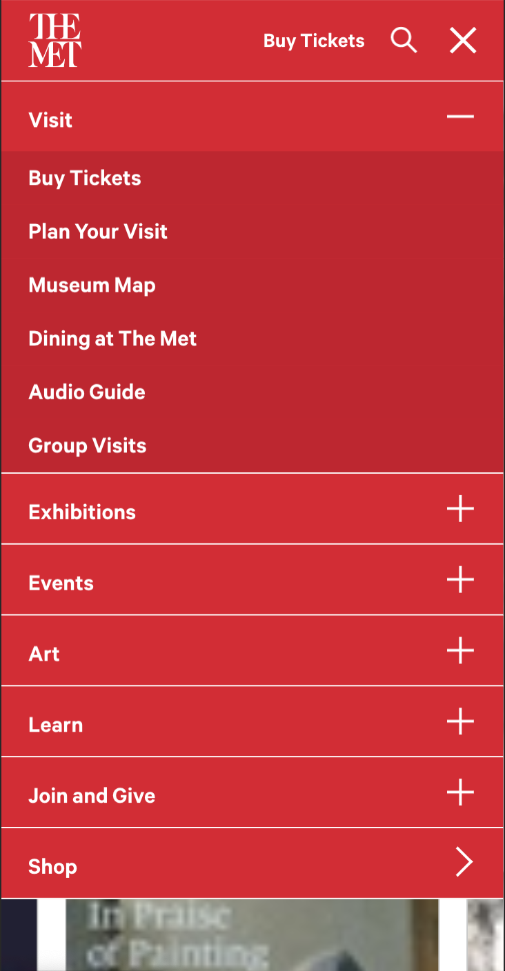
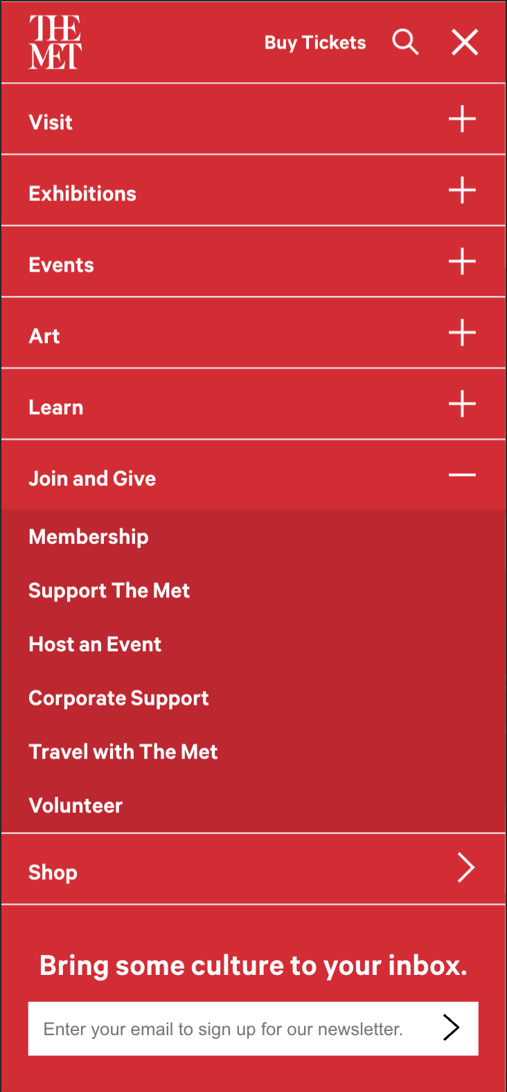
Our mobile navigation did not account for the goals of users on mobile devices.
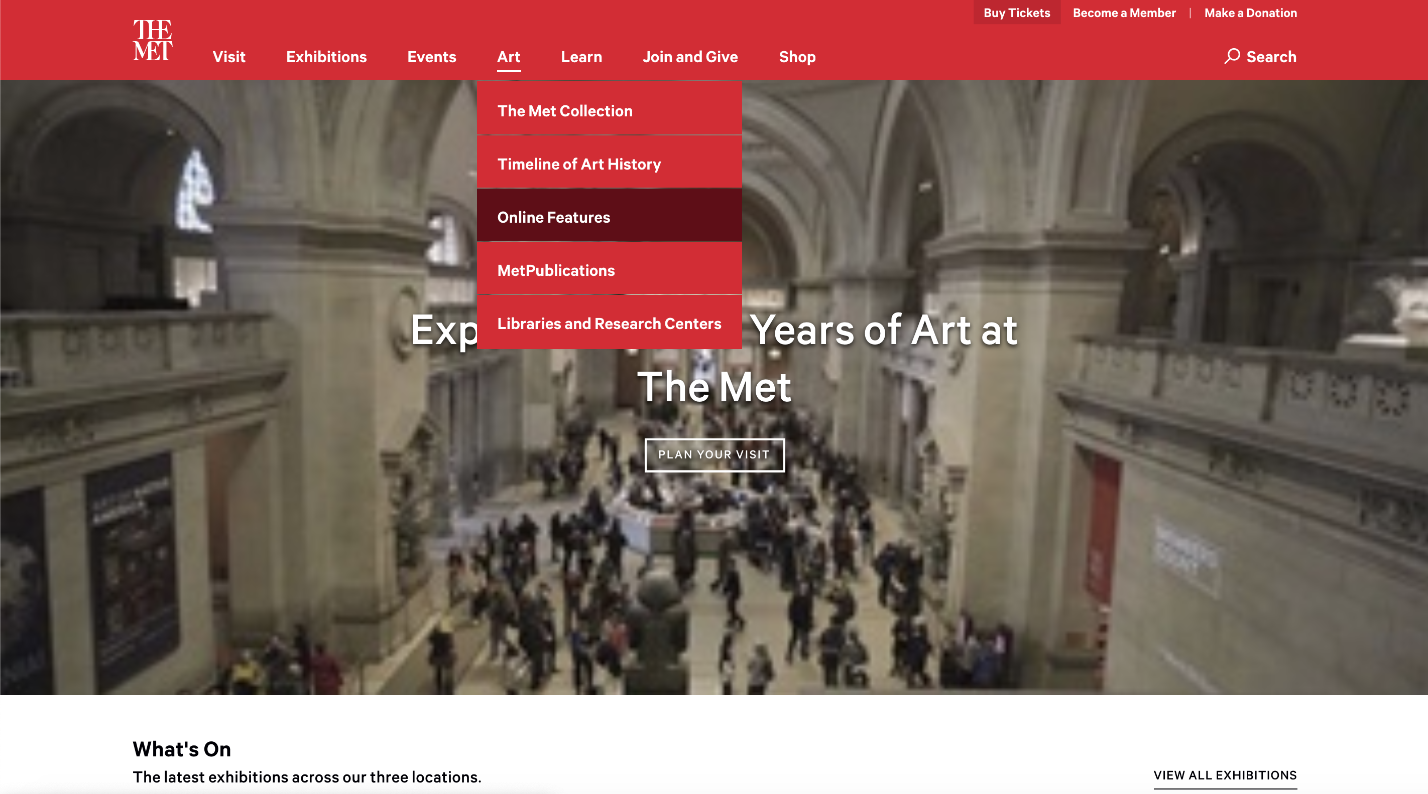
Problem #3
Our language was unclear to users and our information hierarchy was inconsistent.
Metrics of success
We can use real-world analytics to track how we’re doing, and iterate and evolve our design towards success based on our findings.
1.
Increase clickthrough to pages from top navigation for priority pages.2.
No decrease in visits to visit and membership pages.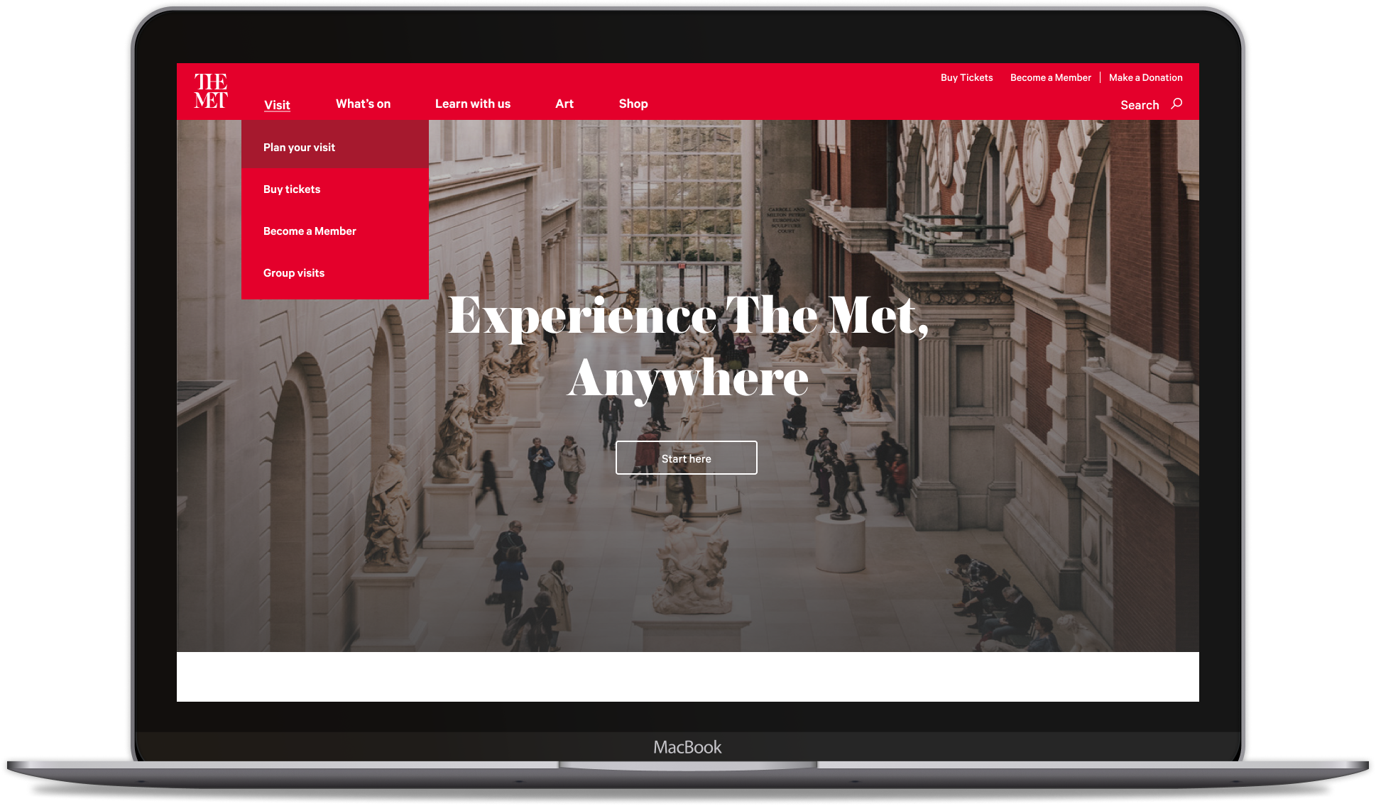
What would this solve for our visitors?
1.
A coordinated navigation that is aligned with user motivations and user actions. A taxonomy that supports clearly defined user journeys.2.
Different devices have different capabilities and our navigation should be optimized for all.3.
Category labels that are familiar and relevant, moving away from internal terminology and sticking to user-first language that clearly articulates user goals.4.
Users should be able to quickly scan the navigation and understand which links are primary, secondary, and tertiary navigation items.Understanding our audience
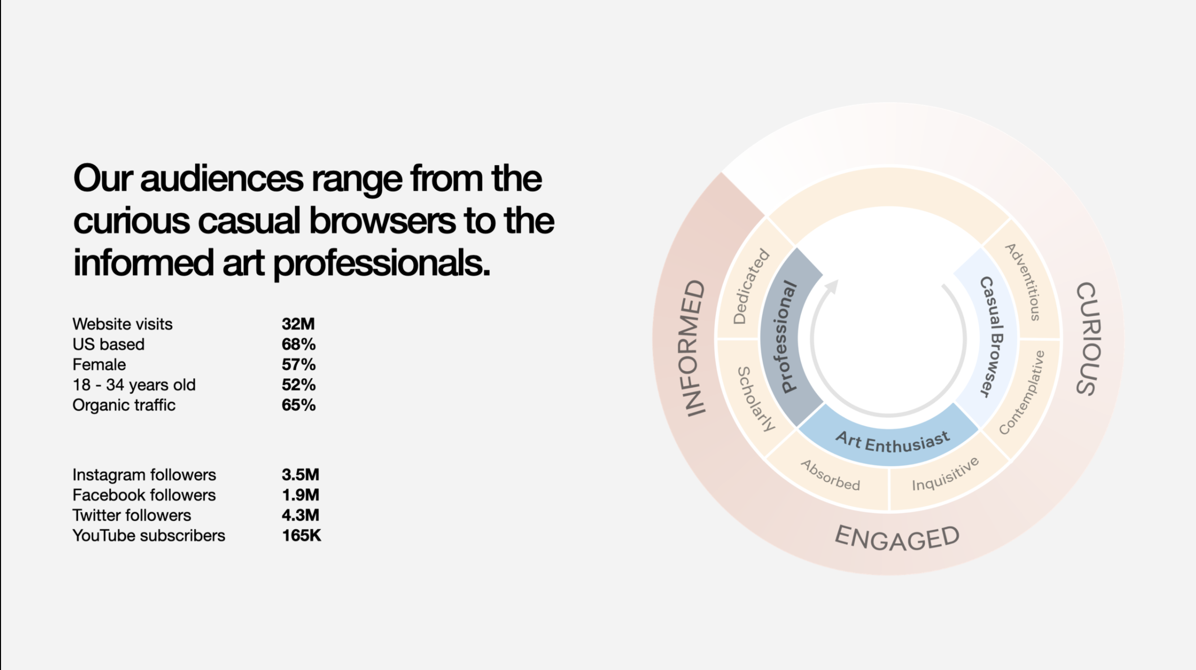
Our audiences are global and are at the heart of everything we do. With data acquired from our analytics team, we were able to paint a better picture of the people we were serving.
Discovery
We focused in on four organizational archetypes to inform our discovery:


User research
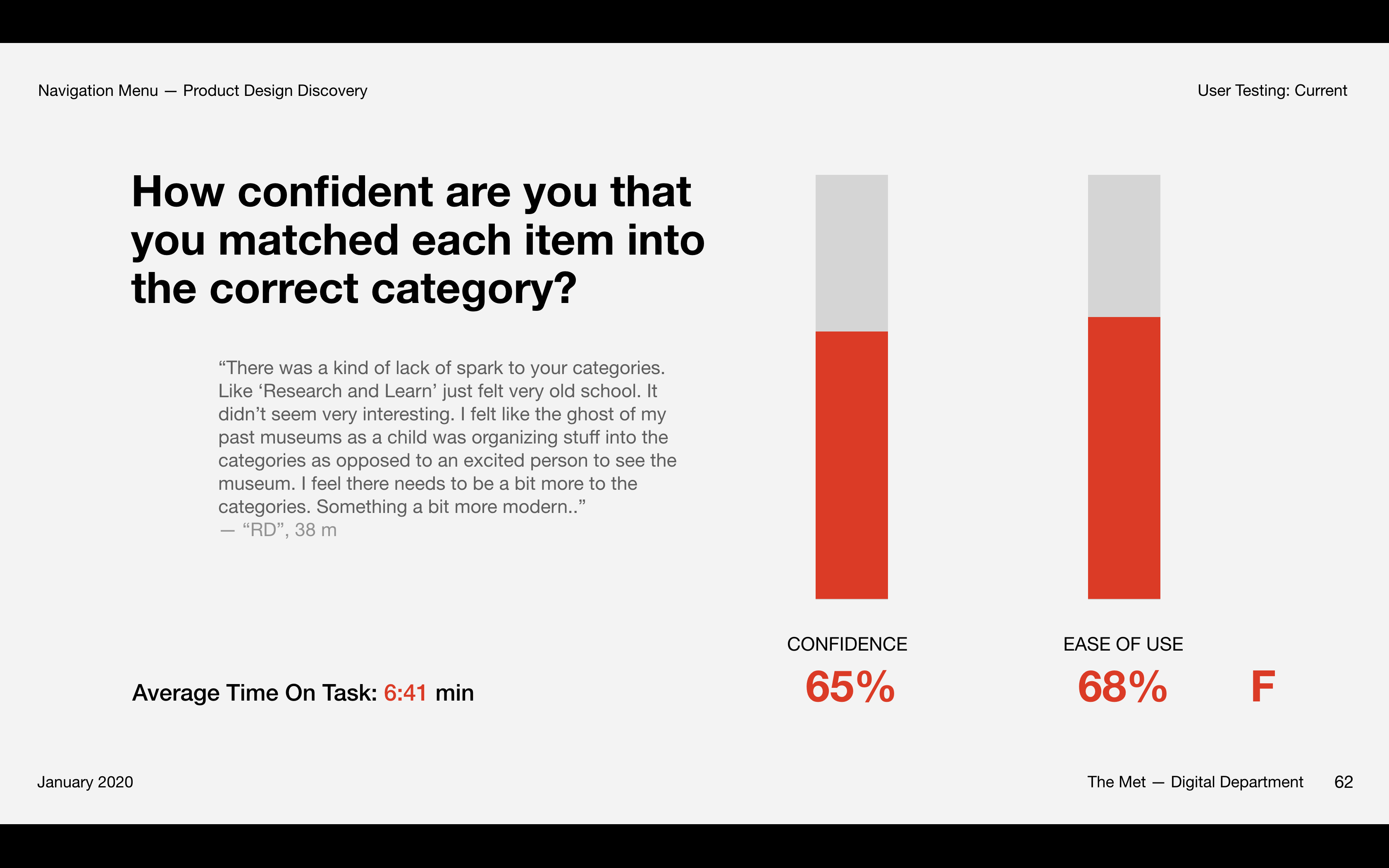
Before going headlong into the nuts and bolts of designing and building a new product, we conducted extensive user testing through usability studies and card sorting.
We found out things like:
1.
Users expect information to be grouped by motivation or service offered.2.
“Museum-branded” terminology obscures menu offerings, prohibiting users from making confident navigation decisions.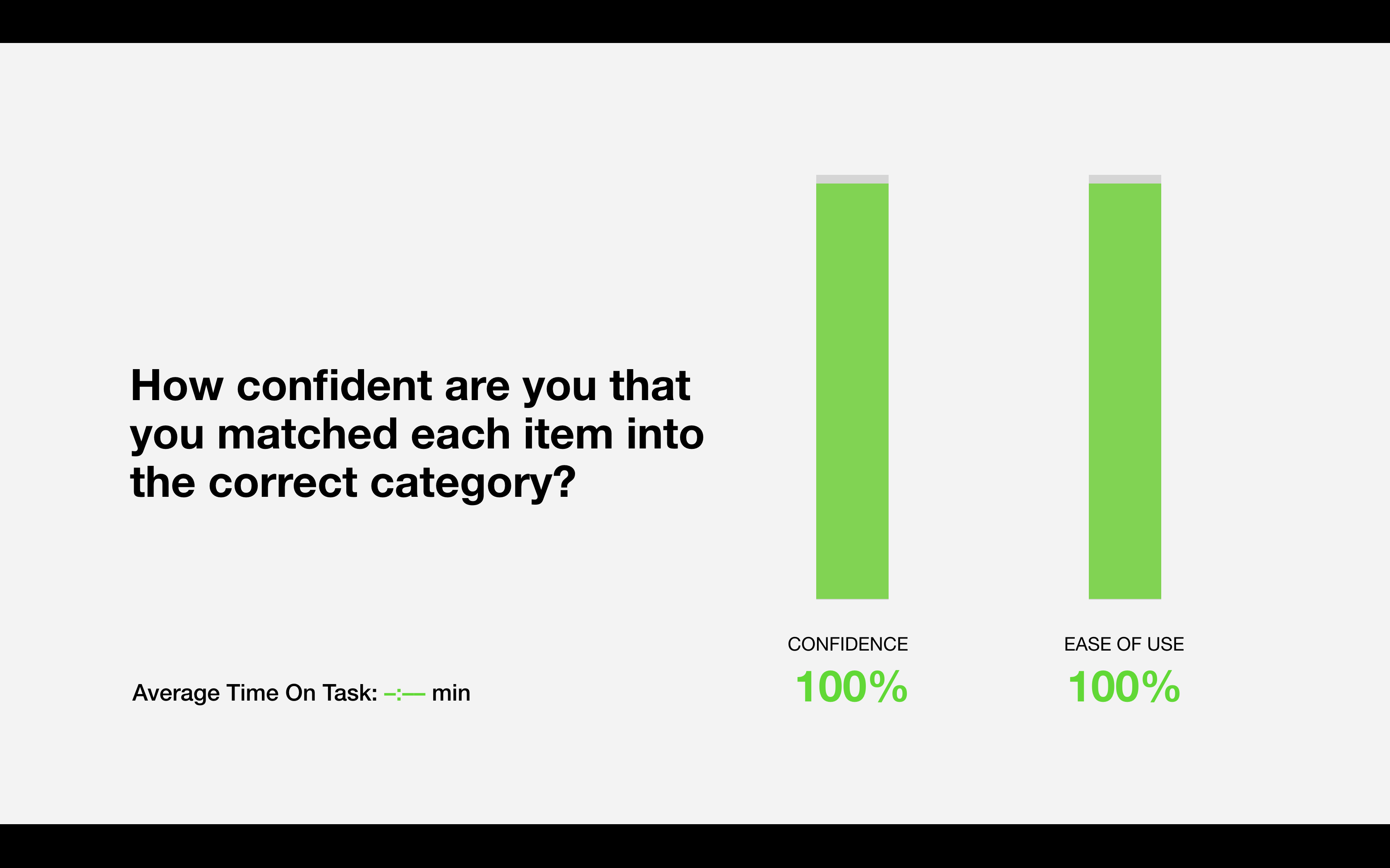
Testing our Hypothesis
Based off of our testing, we made some hypotheses and updated our current information architecture to better reflect what we learned users are expecting.
Our first step was to update some of our navigation terminology and to consolidate some of our pages into the groupings that we learned made most sense to users.
We also updated our footer, which highlights additional information in a more accessible manner.
Results?
In the two weeks after launching the new navigation, we reported a
+47.6% increase
of Product Revenue compared to the two weeks prior to the refresh.We witnessed a total CTR increase of +4.7%, and certain pages like Art Collection received a +13% of clicks.

Next steps
Now that we’ve reorganized the information, our next steps are to track analytics, iterate and evolve the design towards success based on findings.
Once the information architecture is set, next comes updating the UI and visual design.