SafeAssign
Case study Blackboard
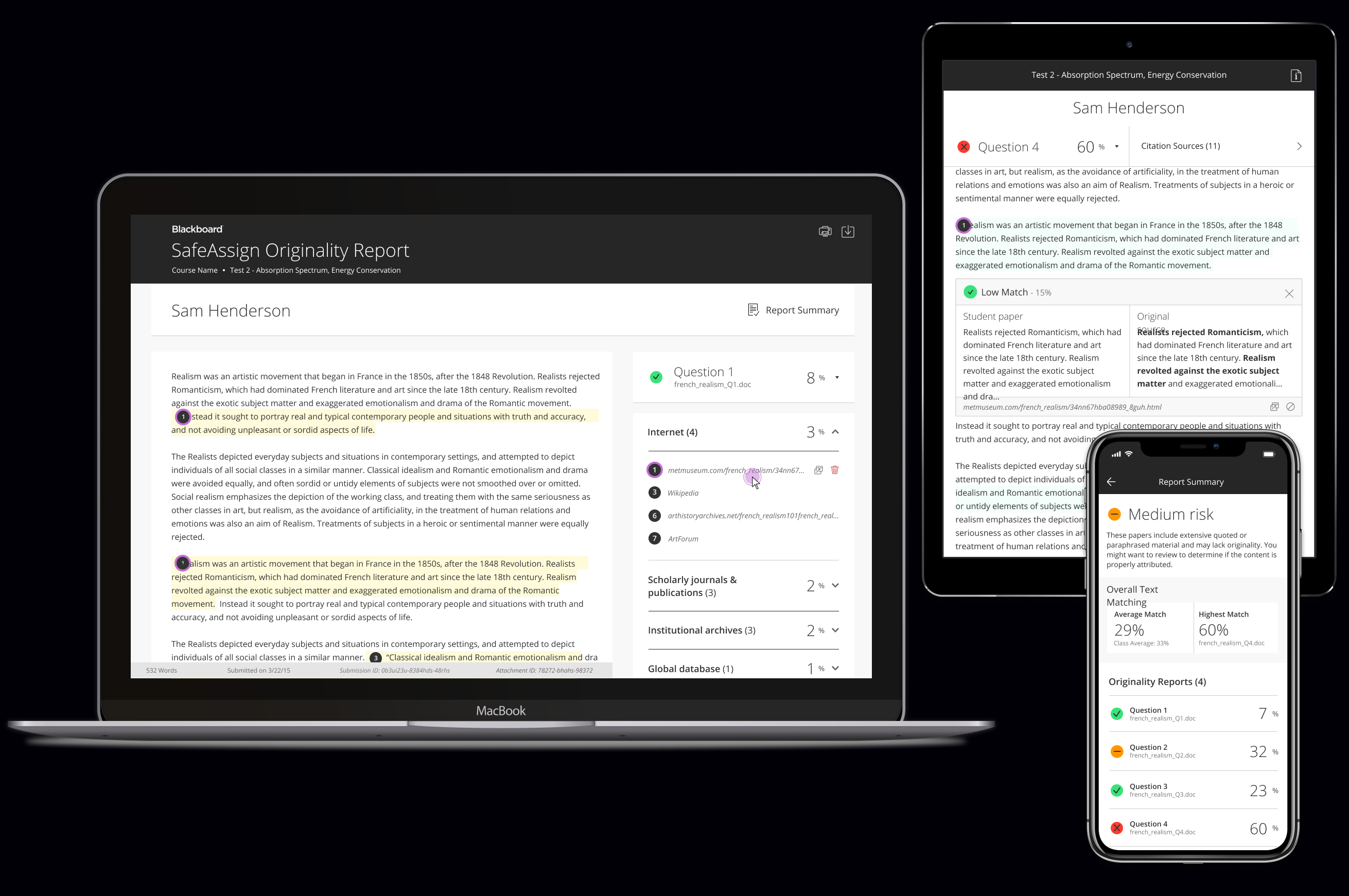
I led the redesign of Blackboard’s SafeAssign experience, including user interface, interaction design, and visual design for both desktop and mobile platforms. SafeAssign is a tool used by instructors and students to detect plagiarism, promote originality, and create opportunities to identify when and how to properly attribute sources.
Experience & Product Designer
2016 – 2018
Problem
One in three college instructors report that their students have submitted papers that plagiarize
the work of others. However, instructors feel they lack the evidence and resources to enforce
academic standards and ensure their students are producing their own work. Identifying and
investigating plagiarized content in student papers can be difficult and time consuming.
Goal
To provide instructors with an easy-to-use feedback and grading tool to detect plagiarized writing and facilitate instructional interventions, empowering students to think critically and take ownership of their writing.
Skills
Interface Design Interaction Design Responsive Design Accessibility Design Wireframing Usability Testing Visual Design
____
Sketch InVision
Zeplin
Team
Myself
Jun 2016 – Dec 2017
Overview
Blackboard’s SafeAssign tool experience needed improving. I was tasked with reconsidering the information architecture, aligning the visual design with our team’s design language system, building out core workflows, considering edge cases, and leading the project’s design through development.
The redesigned platform needed to not only serve as an integrated tool within Blackboard’s Learning Management System, but to also stand alone as a product to be sold outside of Blackboard’s product offerings.
The redesigned platform needed to not only serve as an integrated tool within Blackboard’s Learning Management System, but to also stand alone as a product to be sold outside of Blackboard’s product offerings.
Understanding the current system
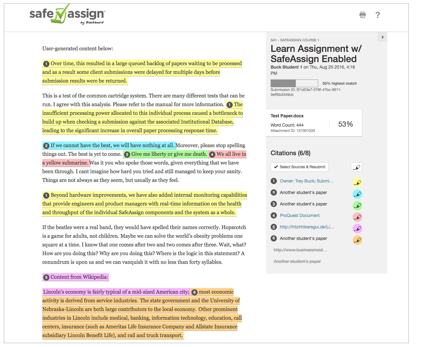
In order to design the ideal platform, it’s essential to first understand the big picture. I started by undertaking an audit of the existing site as well as the sites of our competitors. I took careful note of which capabilities functioned well, and which did not.
Framing the problem
After analyzing the design challenge, I asked detailed questions so I could determine a direction for further research and clarify my own assumptions about the problem. I worked with the Product Manager to get these questions in front of instructors. I asked questions like:
Q:
What is the process of reviewing an originality report and what are instructors looking for?Q:
How does SafeAssign fit into instructors' current grading workflows?Q:
What are the scenarios and contexts that call for using SafeAssign to evaluate student work?Wireframing and iteration
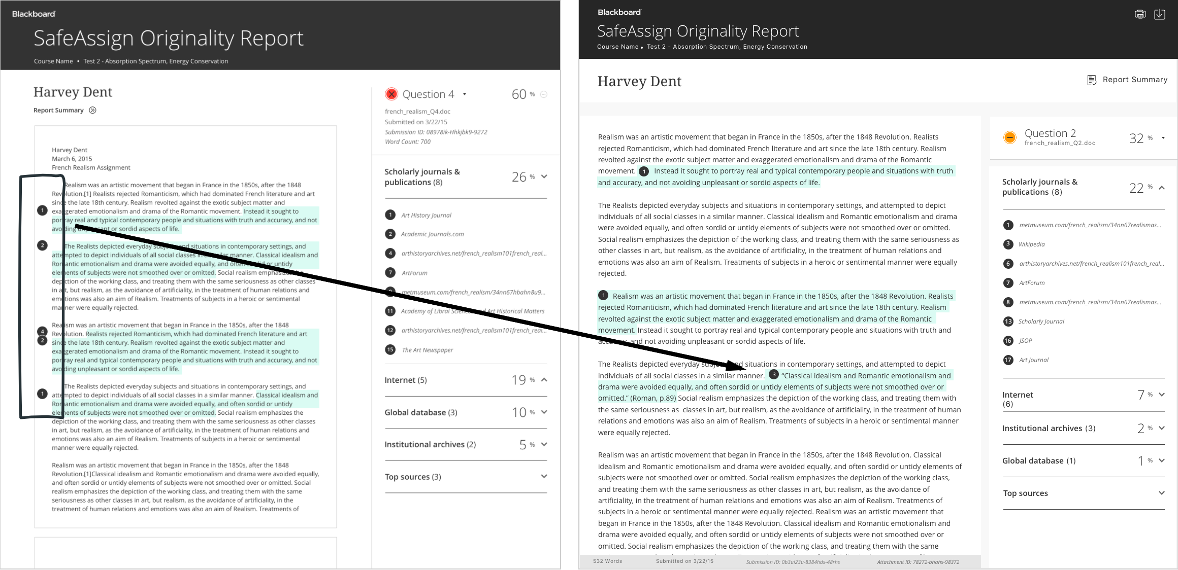
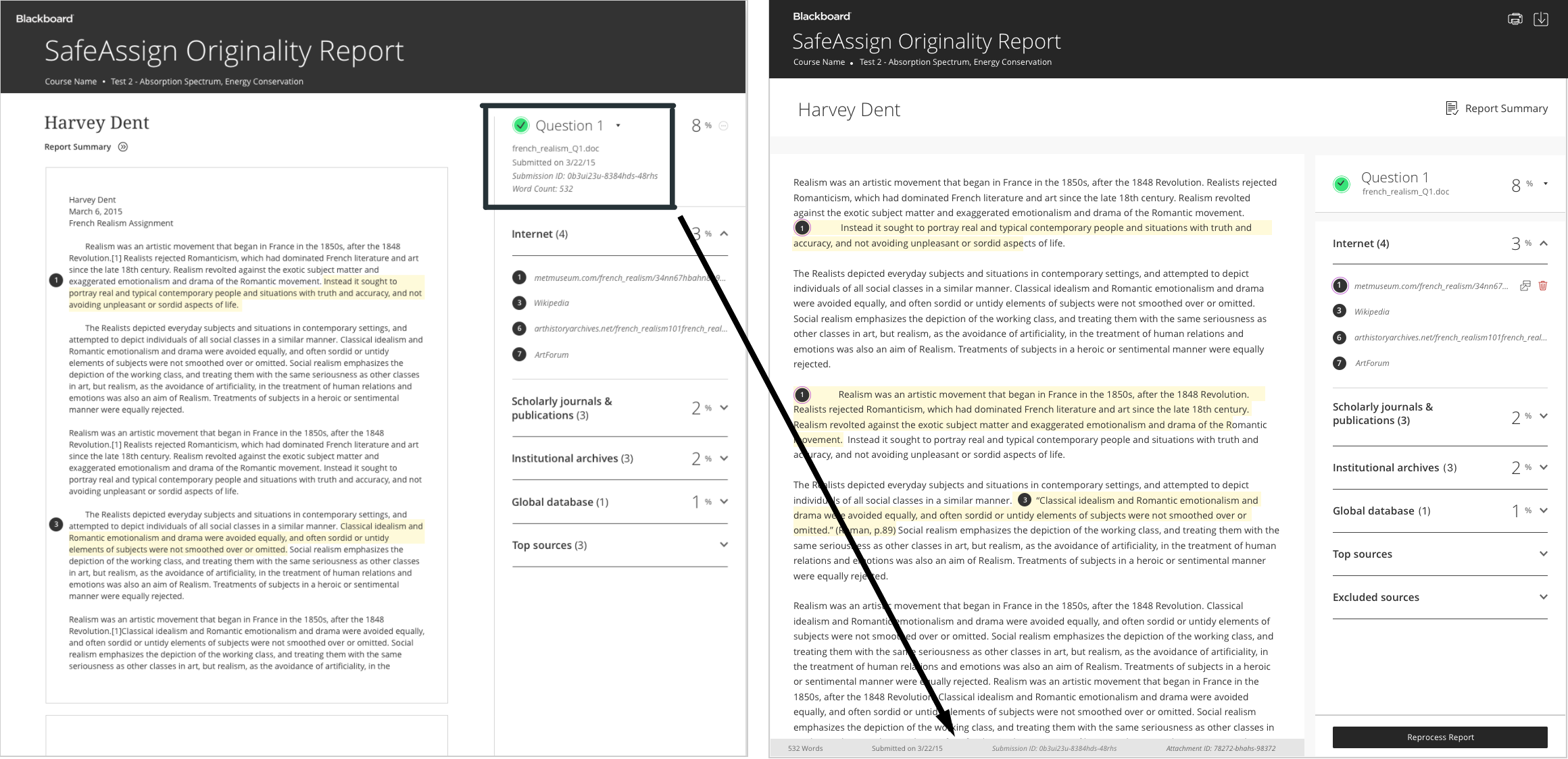
I started to think about how the content should be structured. I created wireframes that would reconsider the information hierarchy, highlighting content and capability over nuanced details. I was interested in experimenting with the exposure and persistence of information, as well as what opportunities existed for employing color indicators.
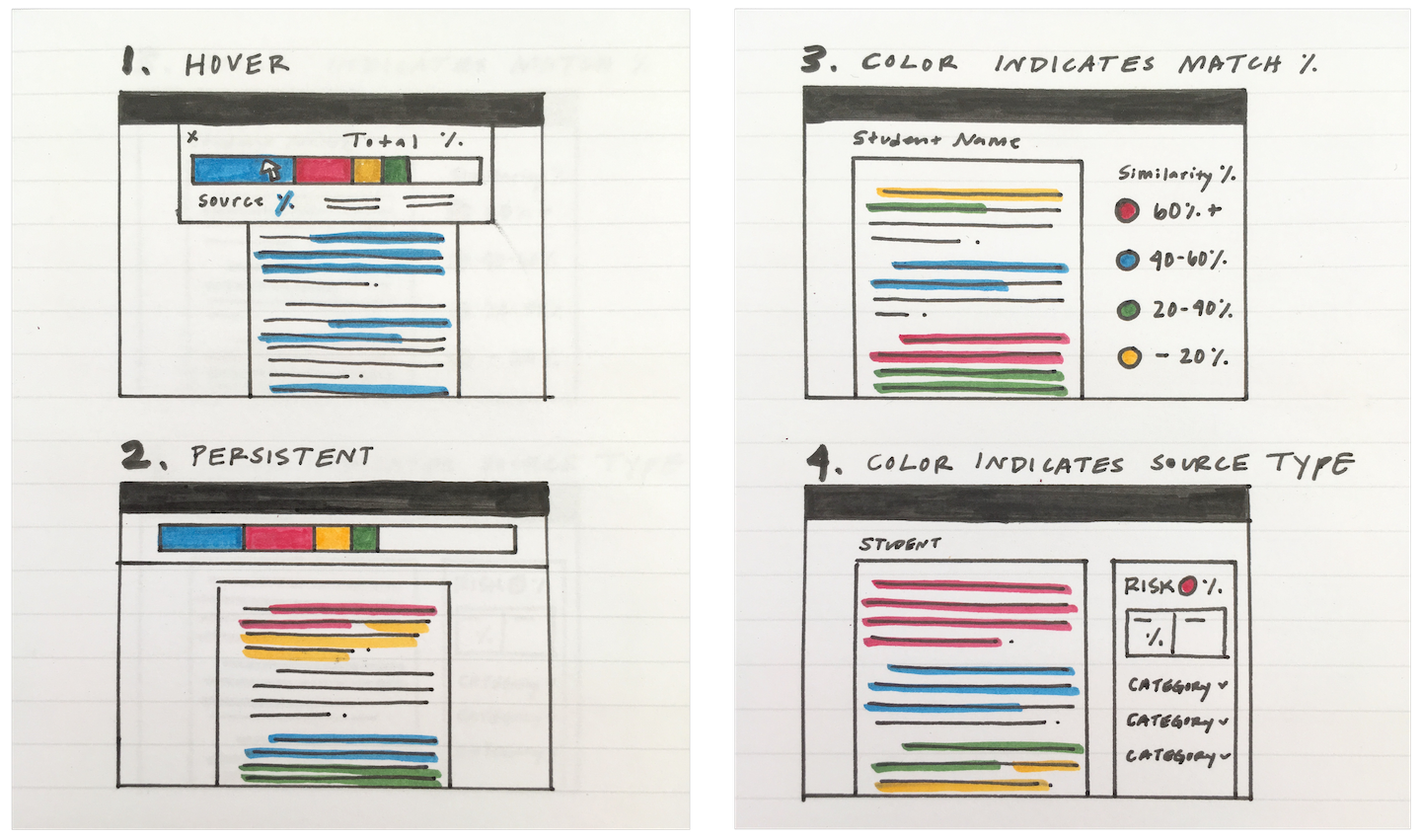
I started to think about how the content should be structured. I created wireframes that would reconsider the information hierarchy, highlighting content and capability over nuanced details. I was interested in experimenting with the exposure and persistence of information, as well as what opportunities existed for employing color indicators.
Defining capabilities
Blackboard’s product offerings create a complex system. My goal in defining SafeAssign’s capabilities was to enable users to guide themselves through tasks efficiently and with confidence inside this complex system, providing multiple ways to solve a problem so users can explore the system with less anxiety about getting lost.
Accessible Overview
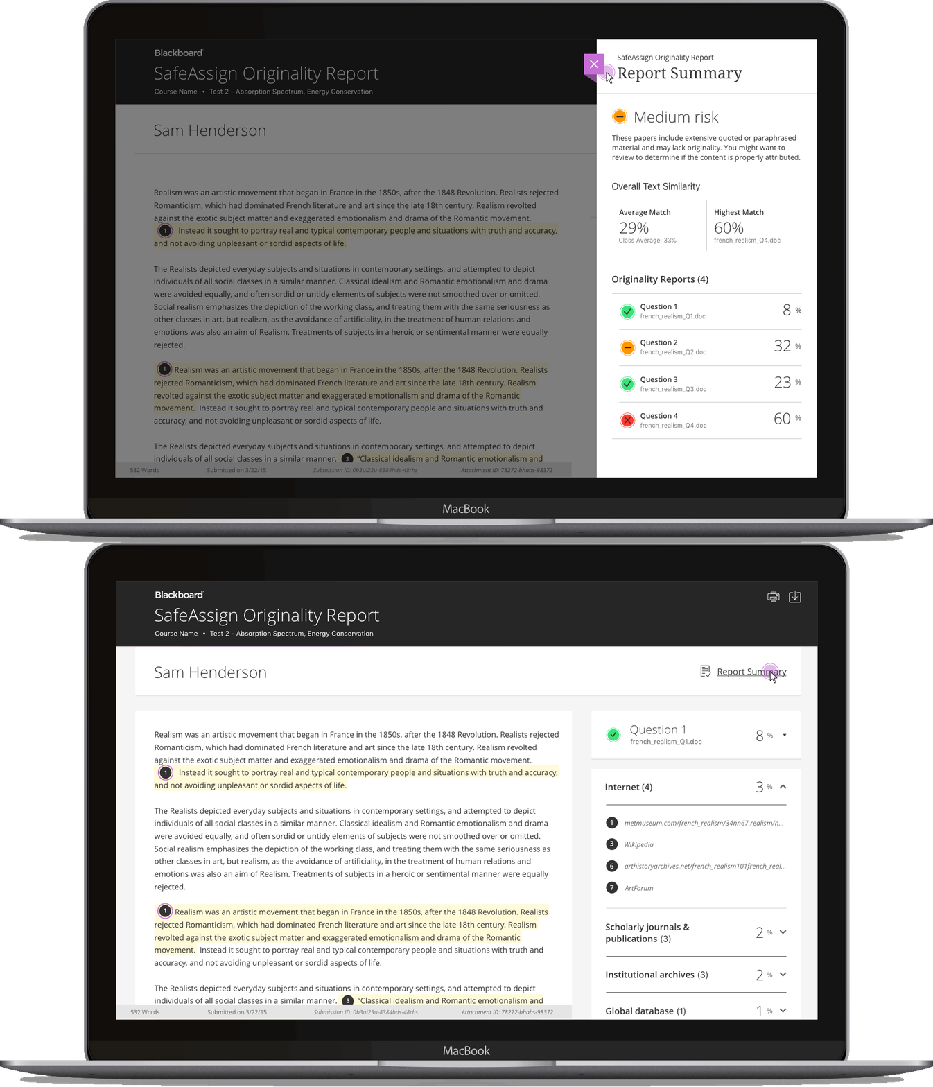
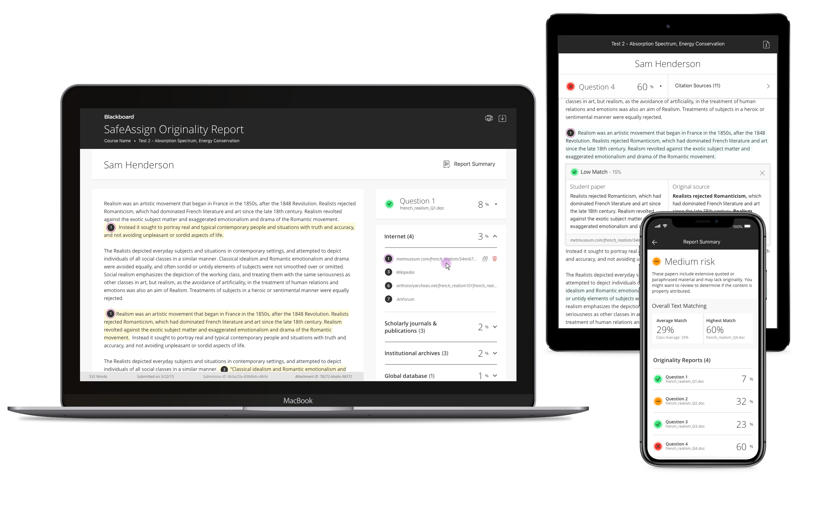
A peek panel overview reduces both an instructor’s and student’s workload to comb through a submission, providing high level insight into the originality of the
student’s writing.
A “risk” assessment of low, medium, or high uses plain
language to clearly indicate the submissions an instructor should pay close
attention to first.
Jumping off points
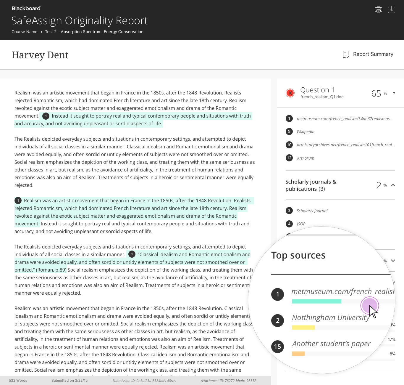
Some instructors expressed not knowing where to start. Having the capability to filter a report by the most frequently used sources can serve as a shortcut for users, providing a visual indication of a source's impact on and inclusion within a student's writing.
Giving instructors agency
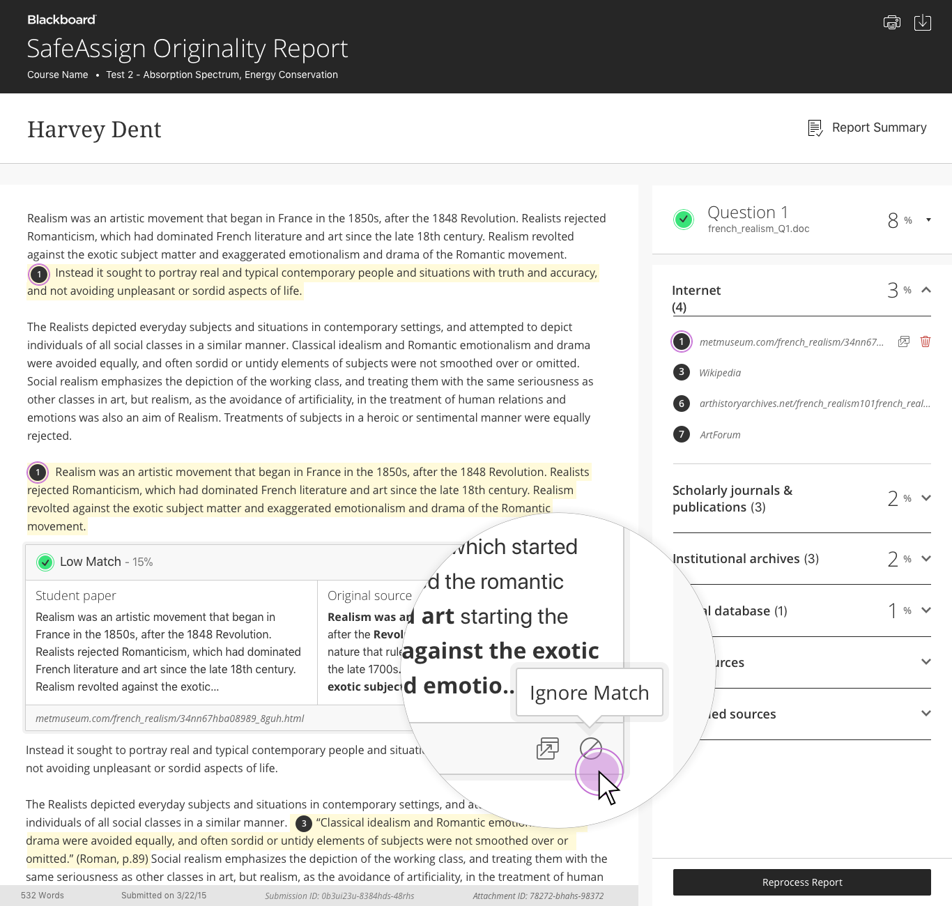
SafeAssign is based on a unique algorithm capable of detecting exact and inexact matching between a student’s paper and source material across several databases.
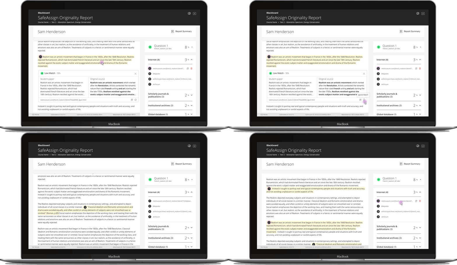
Instructors are given the agency to ignore text matches they deem admissible. The excluded match is then removed from the report’s overall “risk” score and archived. If users change their mind about certain matches, the match can be re included in the report.
Scannability
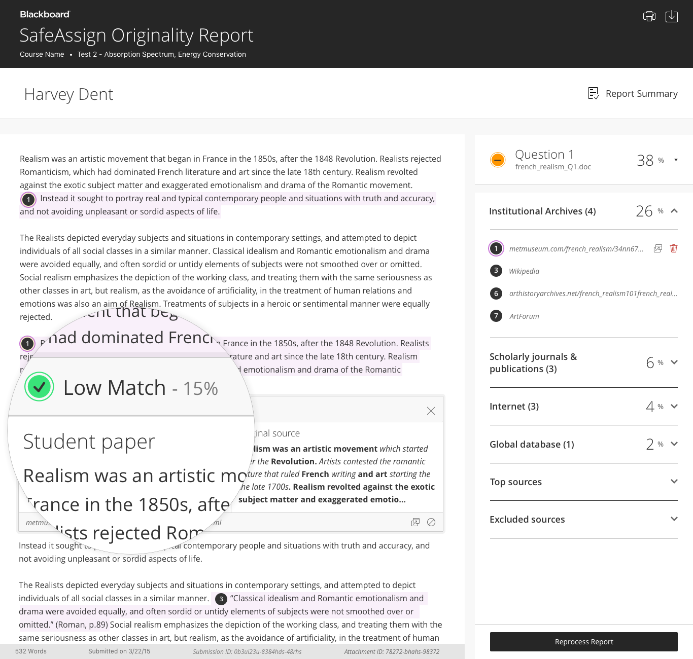
Instructors only have so much time to review an originality report. Clear language and complementary visual indicators illustrating how high or low a paper’s similarity is to an outside source is aimed to reduce workload and improve scannability.
Rapid prototyping
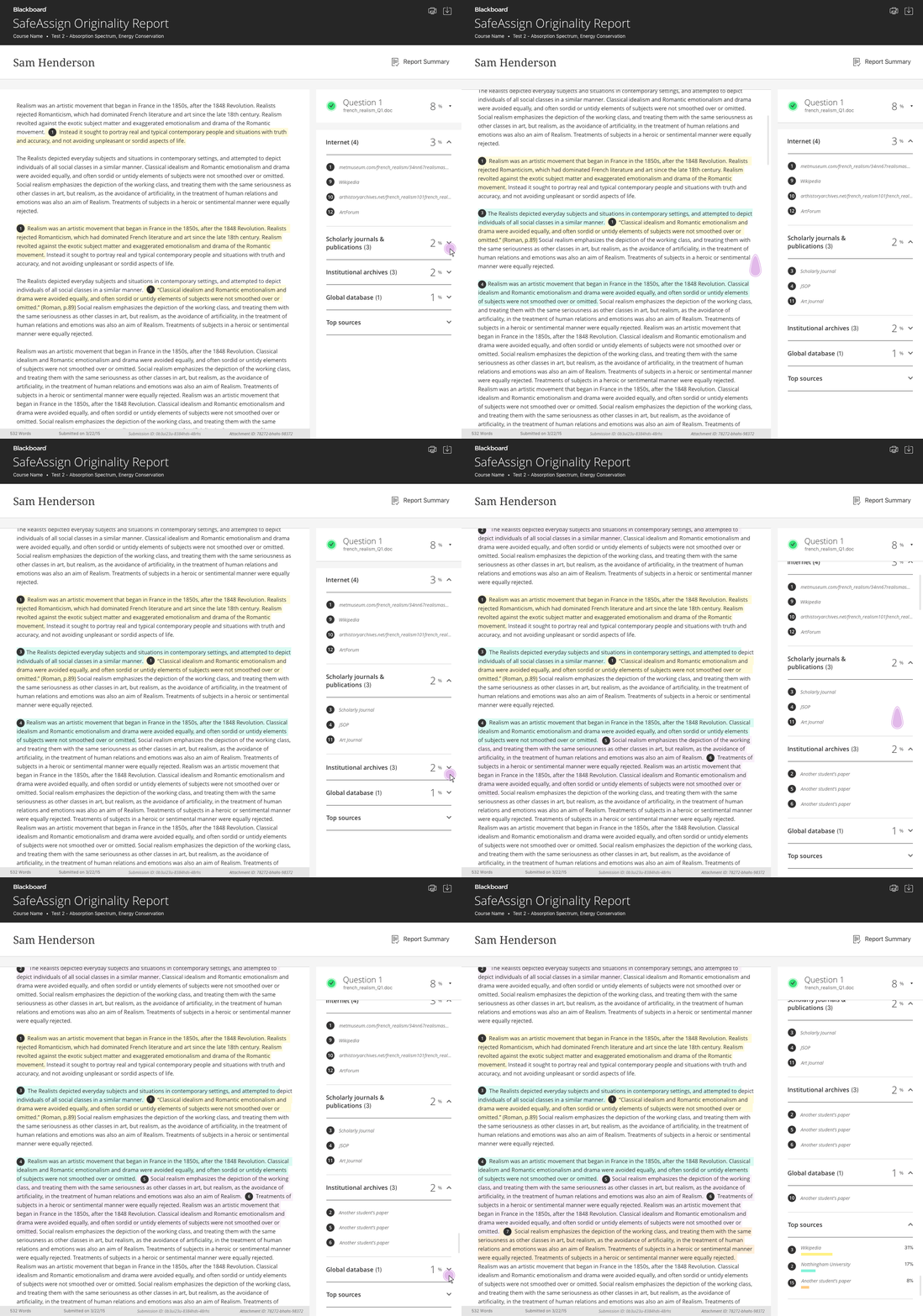
After building out the flows in Sketch, I linked them together to create prototypes using InVision. This was really helpful to make sure I wasn't missing a step in the flow. It also helped me share the concept with the product owner as well as the developers that would build the app.
Final Design
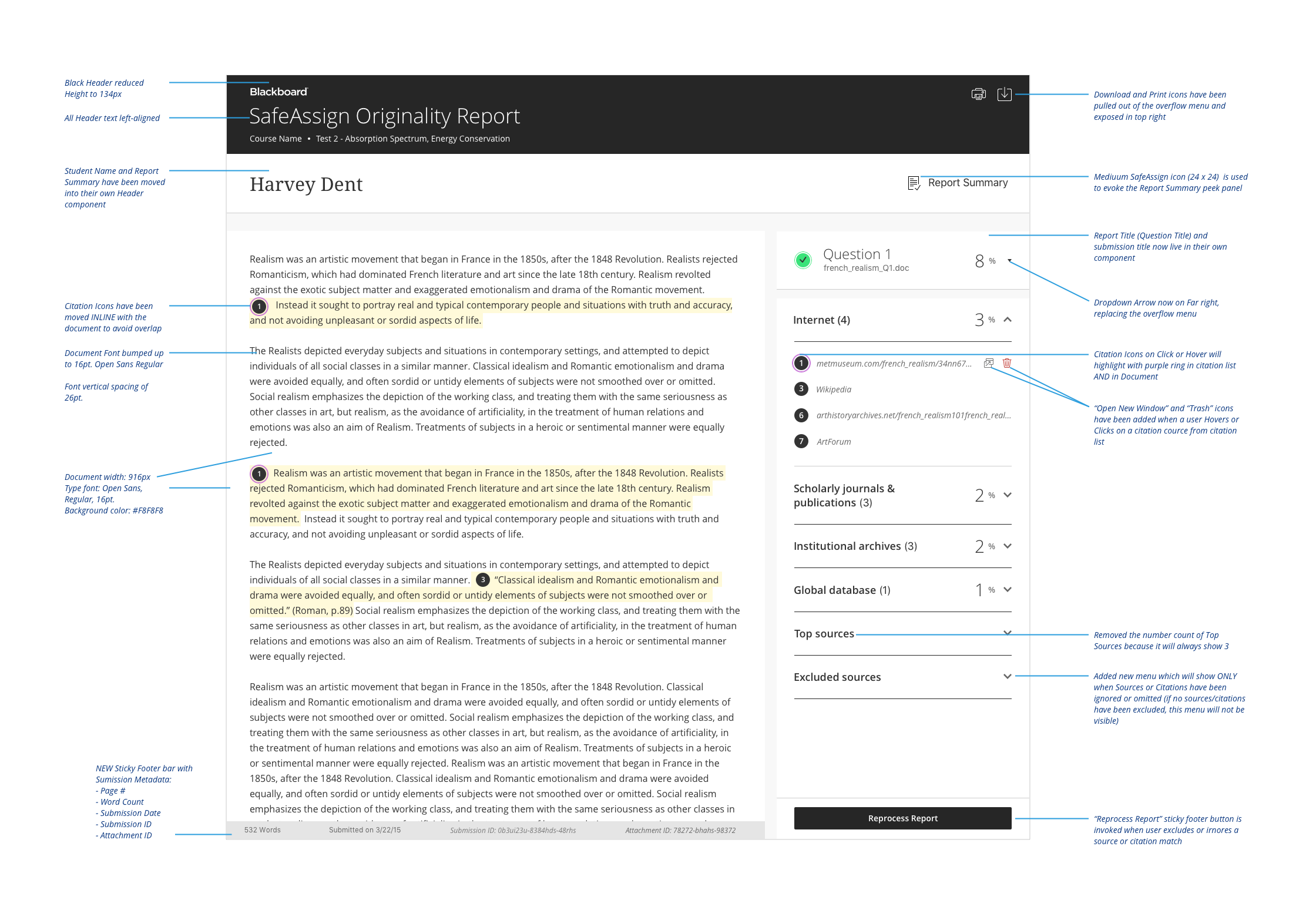
After identifying the key flows and interactions, I created higher fidelity mock-ups and identified any unique components or archetypes that could be added to our design language system. I then worked with the product owner to identify any edge cases that would be need to be accounted for, building out each scenario flow by flow.

Responsive Design
Blackboard users move between phone, tablet, and desktop throughout their day. They need to easily employ prior knowledge across platforms seamlessly. I built out responsive designs to ensure users maintained a consistent experience across platforms.
Development and sizing
Once I validated and finalized designs, I met with the product owner and development team to size out all the features, providing redlined high-fidelity comps and prototypes. I also worked with the Accessibility team to ensure that all designs met the W3C Accessbility standards. I carried these designs through final development working with the product owner and front end developers.
